Programmatic Advertising Website Design — CANDA
- Digital Advertising, One Page Website, Programmatic Advertising, Web Design
Who is CANDA
CANDA is a programmatic advertising business founded by Grant Morgan, a specialist with experience across publishing, ad tech platforms, DSPs, and media agencies throughout the APAC region.
Created to make programmatic advertising easier to understand and easier to run, CANDA helps agencies and brands plan, launch, and optimise programmatic campaigns with confidence — without the overhead of a full-time specialist.
Based in Wānaka, New Zealand, CANDA combines hands-on campaign delivery with strategic support to drive better advertising outcomes.
Key Project Deliverables
Brand-Led Visual Identity
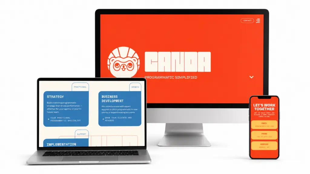
We developed a bold, confident brand system for CANDA that reflects clarity, capability, and momentum. Strong colour contrasts, distinctive typography, and a confident logo work together to position CANDA as a modern programmatic advertising specialist while keeping the brand approachable and easy to recognise.
Fast, lead-Focused Website Design
The website was designed to clearly communicate CANDA’s services and guide visitors toward a single primary action of booking a session. Clean layouts, clear messaging, and structured content ensure the offer is easy to understand while reinforcing trust and credibility.
A clear, confident brand built to simplify programmatic advertising
Branding

Logo
The CANDA logo is bold, distinctive, and intentionally minimal. Built with a strong, block-style wordmark, it reflects confidence, clarity, and structure – qualities that are essential in the programmatic advertising space.
The heavy letterforms give the brand immediate presence, while the simplified construction ensures the logo remains highly legible across digital environments.
Colour Palette
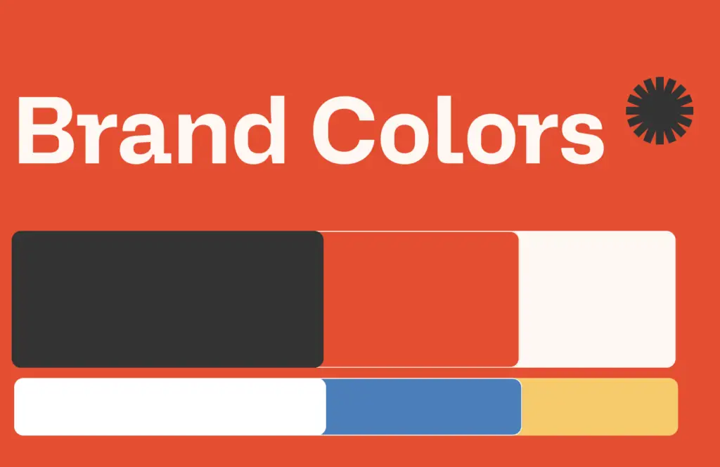
CANDA’s colour palette is bold, high-contrast, and unapologetically confident. Strong oranges form the foundation of the brand, signalling trust, stability, and technical credibility, while blue and yellow accents inject energy and momentum.
These colours are balanced with black, off-white, and neutral tones to maintain readability and ensure the overall experience remains clean and usable.
Brand
CANDA’s brand was designed to remove friction and complexity from programmatic advertising. Rather than leaning into heavy ad-tech language, the identity positions CANDA as a calm, capable specialist.
The brand reflects CANDA’s role combining technical depth with approachability. Clear messaging, confident colour choices, and a structured layout work together to communicate expertise while keeping the offer easy to understand.
Page Layout
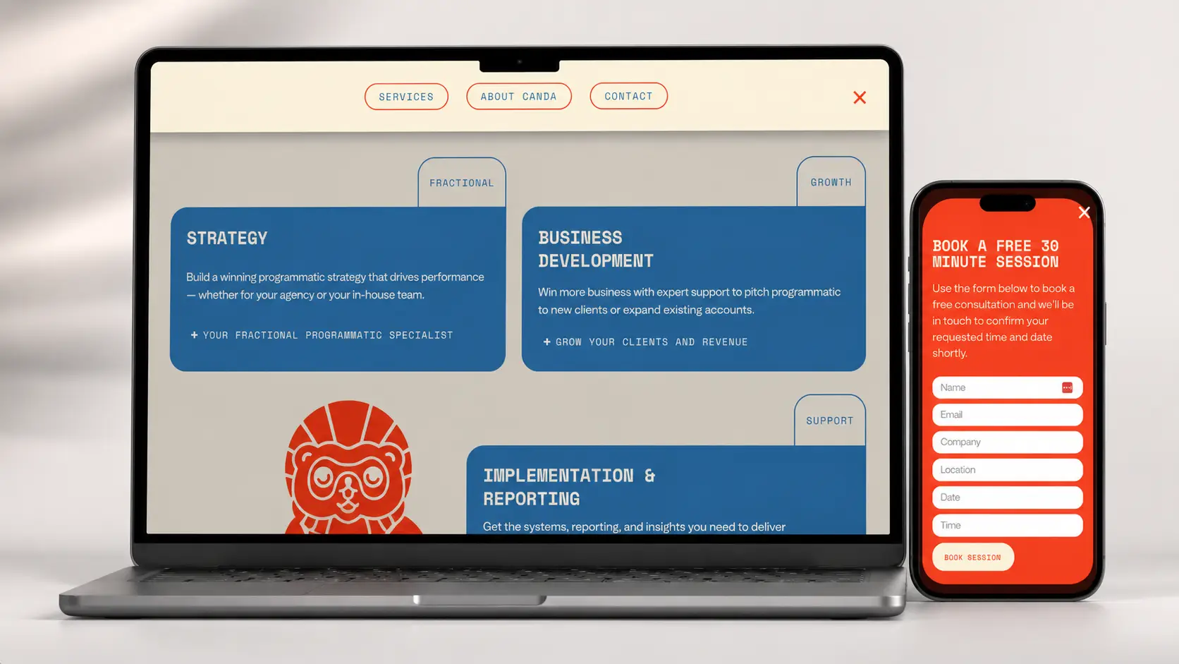
- Clear, linear page flow. The single-page layout guides users through CANDA’s services in a logical order, making it easy to understand what’s offered and where CANDA adds value without jumping between pages.
- Easy-to-read content blocks. Content is broken into clear sections and cards, allowing visitors to quickly scan and absorb key information. Messaging is concise and written in plain English to reduce complexity.
- Simple service breakdown. Strategy, Business Development, and Implementation & Reporting are presented as distinct sections within the page, helping users quickly understand each service area at a glance.
- Friction-free navigation. The one-page structure removes unnecessary clicks, keeping users focused on the message and guiding them naturally toward the primary call to action.
Booking Pop-up
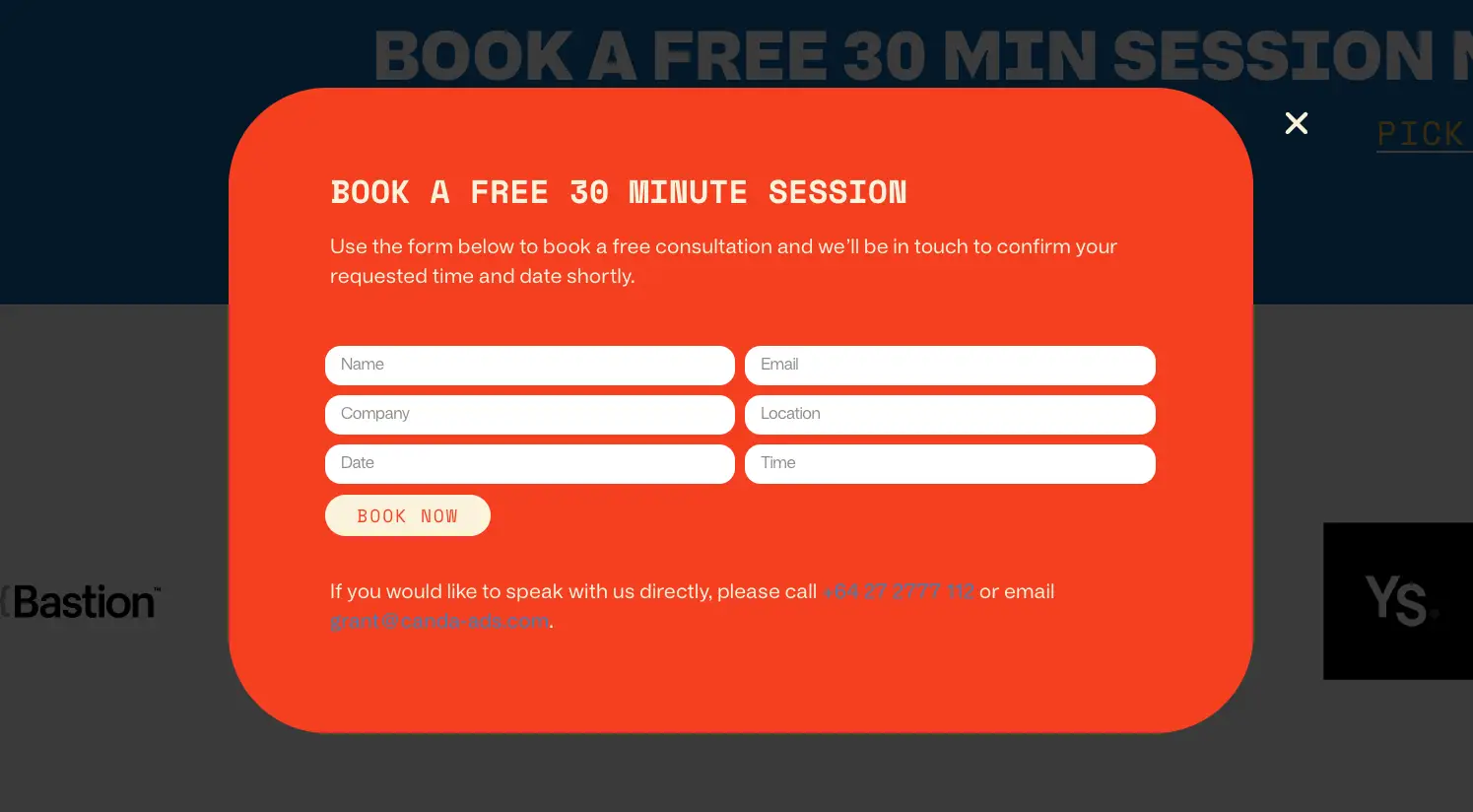
Focused conversion point. A prominent pop-up is used to capture bookings for CANDA’s free 30-minute session, keeping the primary call to action clear and consistent across the site.
Simple, low-friction form. The booking form collects only essential details, making it quick and easy for users to submit without feeling overwhelmed.
On-brand visual treatment. Bold colour use and rounded form styling ensure the pop-up feels integrated with the wider brand while standing out at the right moment.
What CANDA Got
The new CANDA website delivers a bold, confident digital presence that reflects the brand’s goals. Strong visual identity, clear messaging, and a focused one-page layout work together to communicate CANDA’s services without unnecessary complexity.
The combination of distinctive branding and a lead-focused website positions CANDA as a capable programmatic advertising partner for agencies and brands.
CANDA now has a clean, modern platform that clearly explains the offer, builds trust quickly, and gives them a strong foundation to grow.
What we've been working on over the past year.
Explore what we’ve been building lately — real client work, new launches, custom integrations, and creative outputs that show what’s possible.
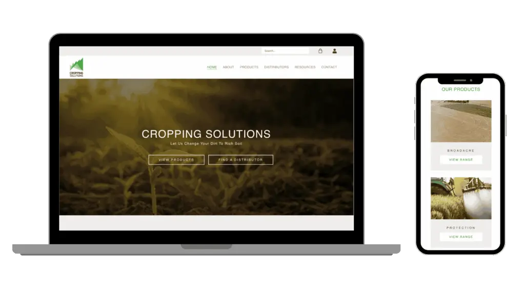
Liquid Fertiliser Website Design – Cropping Solutions
December 4, 2025
Share the Post: