A website project often exposes gaps in a brand that were easy to ignore on a business card.
Suddenly the team needs image choices, headline tone, icon style, interface colours, page layouts and dozens of small decisions that a logo file cannot answer. Without a shared direction, every screen becomes a new debate and the design starts carrying inconsistent ideas.
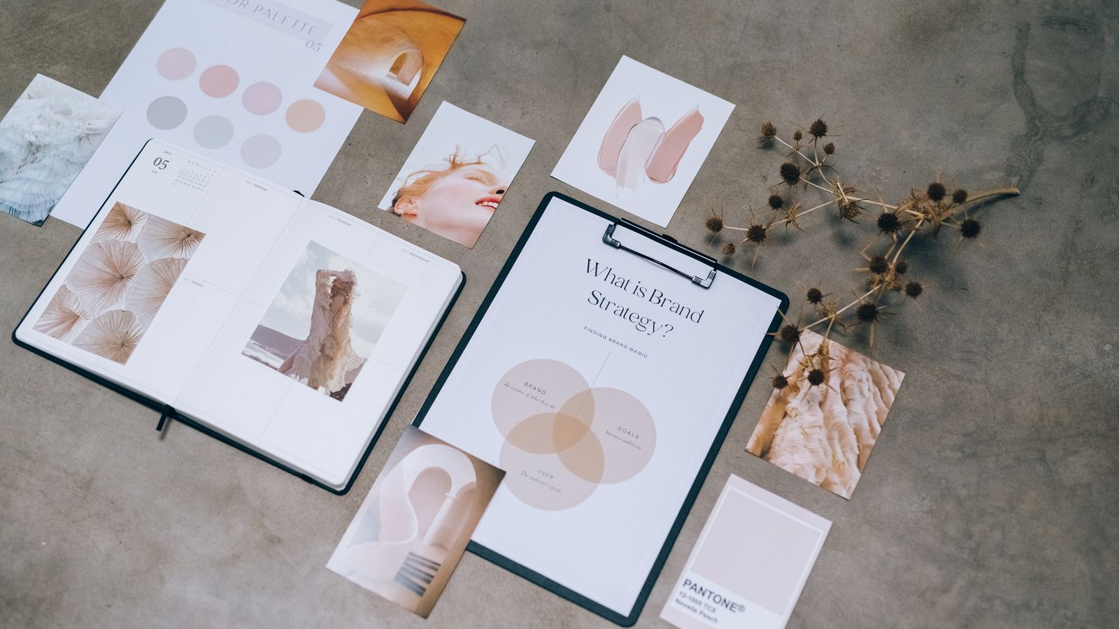
A compact brand foundation before web design can save a surprising amount of rework.
Even a short brand strategy gives the website team a shared basis for deciding what to emphasise, how to sound and which visual choices belong together.
Positioning comes before visual polish
Begin with what the business should be known for and who needs to recognise that value. This does not require a long brand manifesto. A useful foundation can state the audience, the problem you solve, the qualities that distinguish the organisation and the evidence that supports those claims.
If the positioning is unclear, the website may look confident while saying little. Design cannot choose which message matters most on its own.
Define the voice with examples
Words such as professional, friendly and modern are too broad. Show how the organisation sounds in practice.
Write a sample headline, service introduction, error message and call to action. Note language the brand avoids. A community trust, technical supplier and tourism operator may all want to feel approachable, but their rhythm and level of formality will differ.
These examples guide both the copywriter and the small interface messages users encounter throughout the site.
Build a working visual system
A practical digital identity includes more than primary colours. Define supporting colours and their roles, accessible combinations, type hierarchy, spacing, border and shape language, image treatment and icon style.
Test the system on real components: a service card, form, article, statistic and mobile menu. This reveals whether the palette and typography can handle everyday content, not just a presentation cover.
Art direction makes imagery coherent
Generic stock photography can quickly weaken an otherwise considered website. Decide what subjects, perspective, light and level of polish suit the organisation.
Existing photography may need a consistent crop or frame. New photography benefits from a shot list based on actual page needs: people doing the work, useful details, locations and moments that provide evidence.
Illustration or graphic treatments should have enough rules that future assets still look related.
Let the content influence the identity
Brand and website work should not happen in sealed stages. A visual system needs to accommodate the content the business genuinely has. If case studies are central, the identity must support long-form storytelling and project imagery. If product specifications are important, clarity may matter more than expressive layouts.
Test direction using the hardest content, not a perfect three-line placeholder.
Create enough guidance to continue
The final output should help the internal team make ordinary decisions after launch. Include logo use, colour values, type styles, image examples and a few templates or components.
The aim is not to control every future piece. It is to create recognisable boundaries within which new work can be produced confidently.
Treat brand direction as practical infrastructure
Clear direction speeds approvals, reduces subjective debate and gives website components a consistent character. It also makes social graphics, proposals and internal documents feel connected without recreating the look each time.
Web Paste combines brand direction with website design and development when an organisation needs the two to evolve together. Our Raglan Naturally Community Trust project is an example of a brand system, content structure and website experience built around the same foundation.