Edison Darby is an active investment firm and strategic collective that grows internationally capable, technology-enabled businesses.
Key points
- Branding and logo design from scratch
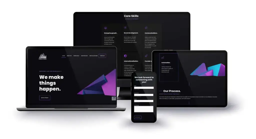
- Bold colour and mountain icon symbolising growth
- Website built with custom geometric graphics
- Stands apart from traditional investment firm sites
The brief
As a startup, Edison Darby needed a full suite of services, from branding and logo design through to website design and build. The brief came down to one word: “edgy”.
What we delivered
Starting with the logo, we used a bold colour and mountains to symbolise growing businesses, which is the firm’s bread and butter. The website was built around those stand-out colours and sharp edges using custom geometric graphics.
The result
The result is a website that stands out from the traditional investment firm look. Having worked with the team behind Edison Darby in previous businesses, it was a pleasure to work with such experienced people again.